Dieter Rams: 10 principles of Good Design in a digital world
Dieter Rams: 10 principles of Good Design in a digital world
September 23 2019

Search Experiences Designer
In previous posts, my teammates & myself have mentioned the influence of design movements like the Bauhaus, minimalism and so on. This time, I will refer to Dieter Rams, who I personally consider one of the most representative of what we may call ‘minimal’ design.
Rams was primarily the creative leader of Braun and responsible for many timeless technology pieces that keep influencing a lot of popular devices we daily use.

The primary motto for Rams has always been “less is better”, while simultaneously making products that are self-explanatory and, thereof, easy to use. This philosophy for physical products fits perfectly with the interaction needed in complex sites and services in our daily life.
Regarding problem solving design, although Rams 10 Design Principles are primarily focused on physical products, they can (some say must) be considered in design and development of digital products and services.
Let’s explore them and see how we can apply them to reach modern, stylish and functional solutions:
1.Good Design is innovative
Good design has to avoid being derivative; it must push the understanding of the product and incite to interact straightforwardly, while iteration and refinement push forward to innovation and progress.
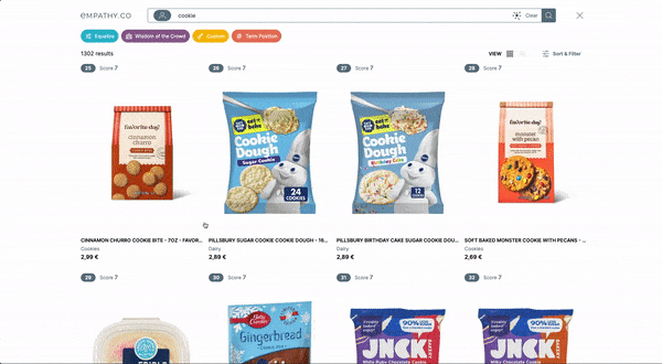
At empathy.co, we always pursue perfection and innovative solutions to improve interactivity. We do not lock ourselves, for instance, in a search box; we try to expand the interaction through voice, image and video in a way that is up to the users and their needs to achieve the best results in their own way.
2. Good Design makes a product useful
Dieter’s principles expand the perception of the primary function of a product so, when good design is present in a product, it connects with the user identity and self-perception, increasing the emotional value from the user’s point of view.
This matter can be clearly seen in how people try to reinforce their projected image through their possessions: a Tesla (environmental conscience), a Mac computer (creativity) or a Nest (comfort). These items not only perform as they are expected (a car, a computer, a thermostat); they are perceived as the maximum reference in their segment.

The common factor among these products is that all of them try to simplify their use, making them accessible without losing any functionality. In terms of digital products or services, this translates in solutions that are straightforward, easy to understand and memorable.
3. Good design is aesthetic
Although aesthetics is a subjective value, there are certain values like consistency, patterns and colours that can be used as a starting point to deliver a pleasant and enjoyable digital solution.
Visual language in Dieter Rams’ products is obvious: they are like a family, and through his usage of typography, proportions and colour, provides us, interface designers, a clear path to follow when creating a new service.
4. Good design makes a product understandable
Braun products purpose is self-explanatory, and so it should be our digital product. Nothing is worse than creating an interface and have to explain “how to use it” because the target user does not understand ‘what’ it does and ‘how’ to use it.

This is, probably, the point that is more related to ‘the simpler, the better’ concept. To achieve an optimal solution, we have to think in terms of context (show what the user really needs) and simplicity (clear CTAs and results of any action from the user).
5. Good design is unobtrusive
This is an expansion of the previous point, where, when an interface or product goal is completely understood (we know the ‘what for…’) the key is the success in achieving the purpose avoiding any error of frustration from the user.
In a physical product, controls order, what they do, and how to adjust the output to meet the user goals have to be clear to minimise the learning path. In digital products and interfaces the equivalent is to guide the user through limited sets of requirements (wizards, hierarchical selectors…) and clear warnings & messages informing the user from any unexpected deviation.
Errors and mistakes lead to frustration and it is key to avoid them.
6. Good design is honest
As always, the main focus on a product is the result, what they deliver and avoid frustration from unexpected outputs or, what’s worse: misleading the users to push them into something they probably are not interested.
In interface design, the ‘dishonest’ practices are, for example, hidden costs (delivery, optional services that require and opt-out) and, although the revenue from this may be appealing, the long-term success goes through complete honesty.
7. Good design is long-lasting
This is a hard one to follow, as everyone knows the digital services are the first victim of what we may call ‘trendy design’. Creating a long-lasting design, a visual and functional style that works in the long term it is necessary to find ‘your own path’ and isolated from any external copy-cat trend that may be popular, but probably will transform into a fad.
Trend and fashion are like a ‘loop’ and the curious thing is that the core, timeless and long-lasting value on those products and services that stick is simplicity (again :-))
8. Good design is thorough down to the last detail
A good interface requires the same amount of love and craftsmanship to each of the elements that are shown to the users.

From the smallest icon to the subtle curves (or lack of) of buttons the typography choices made, everything has to be consistent, and the most minimal detail that does not comply with the visual language or style may become a major problem in terms of branding as, believe it or not, most users will notice the mistake.
9. Good design is environmentally friendly
This is probably the most difficult to translate into the digital products realm. A physical product is connected to the real world (materials, energy use, toxicity, durability…) and to create them with and eco-friendly mindset is relatively easy. When we translate this requirement to the ‘digital world’, we are limited to a couple of metrics… time & energy consumption may be the clearer that comes to mind.
The requirements for an application in terms of energy, when we think individually, may not look like a major issue; but when something is deployed online to be used by millions of persons, the carbon footprint is huge. To decrease the impact, things like limiting the power required to run an app or service (simpler frameworks, not abusing high end techniques like VR unless it’s really justified) and fast responses to reduce the energy consumption are key aspects and lead, again, to think in terms of simplicity.
10. Good design is as little design as possible
Translation ‘simplify things to the deeper and more obvious solution… always’. Focusing on what we want to deliver will lead to the how, and believe it or not, the simpler the solution, the better.
The most difficult part is to integrate this simplicity into an innovative and recognisable visual language (as a brand). I guess that’s why we, designers, are still kicking around and permanently refining icons, illustrations… and what someone could think that it is ‘reinventing the wheel’, in fact, it is refining in pursue of the perfect solution.