
Exploring the Consumer Journey
Exploring the Consumer Journey

Senior Data Engineer
Knowing how the customers search through a site is important to improve their shopping experience. For this purpose, a key concept is employed: the consumerjourney, defined as the user’s sequence of search queries during a session on a site. The journey comprises the terms the user enters in the search field, and their order is a source of valuable information.
Depending on the nature, traffic and even the design of a site, the user journeys will have different characteristics. An initial exploration of the high-level features of the data will help to choose the appropriate analysis.
In an online supermarket, customers spend a longer time shopping; they search for a wider variety of products but spend little time to find each of them. Ideally the user finds the desired product with a single search, and the journey looks like a shopping list of different products (ex. apple-banana-grapes-milk-water-rice-spaghetti).
If we take a first glance at this type of data, an interesting visualisation is achieved by aggregating all the user journeys. The overall view for a supermarket (figure 1 below) has a multitude of small term clusters corresponding to products that are bought together – fruits, for example. The connections among the product groups were filtered out due to their relative low relevancy compared to the links between products inside the same cluster.
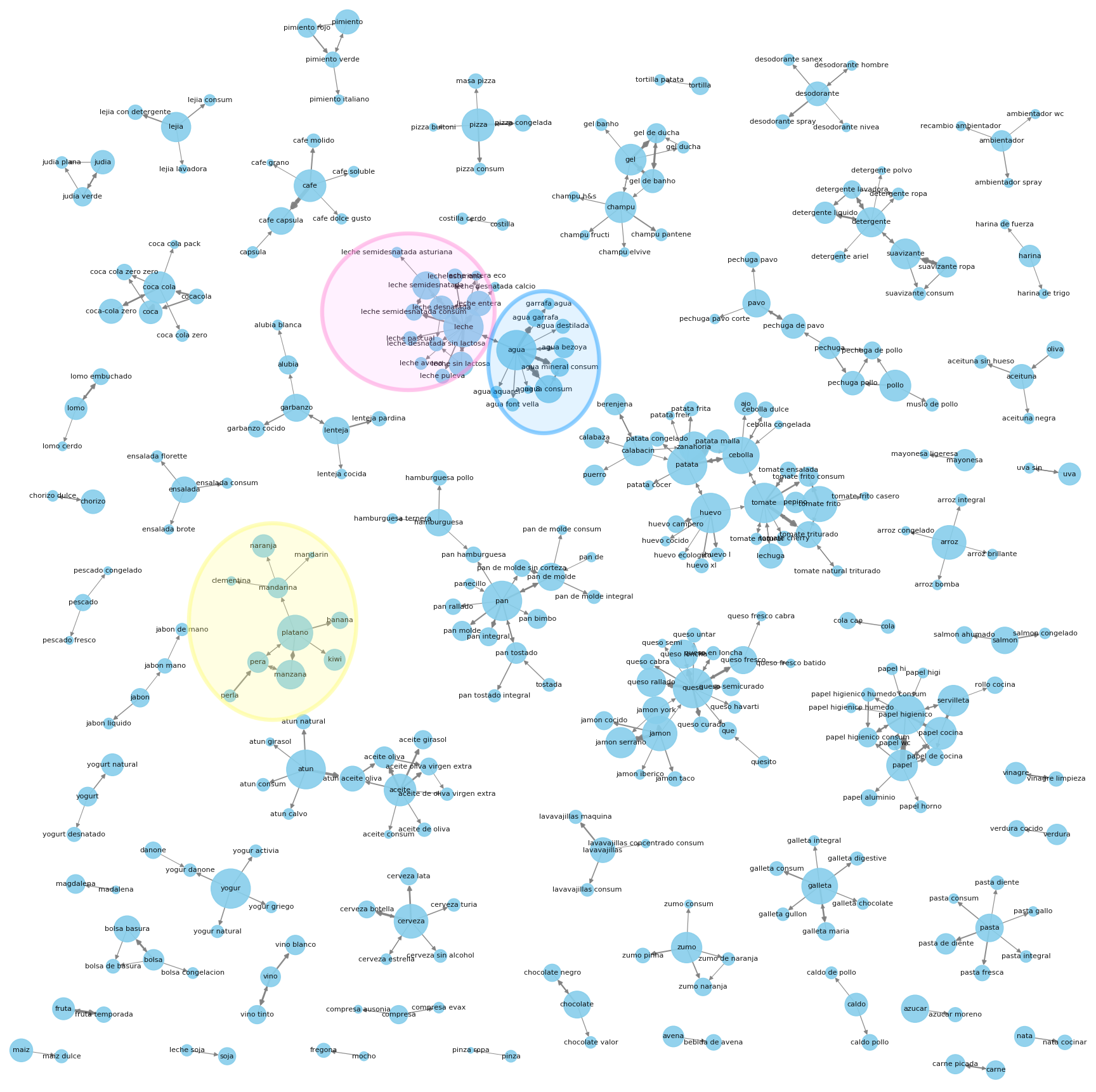
Relevant knowledge can be leveraged by just looking at each of these strongly connected term clusters. For example, milk is often bought together with water; this relationship can be analyzed to improve the products that are suggested to the user during shopping. This analysis can also help to organize the products for more intuitive browsing. The different types of cheese and ham appear linked together so a ‘sandwich fillers’ category would be a better choice than instead of having them in separate ‘dairy’ and ‘meat’ sections.
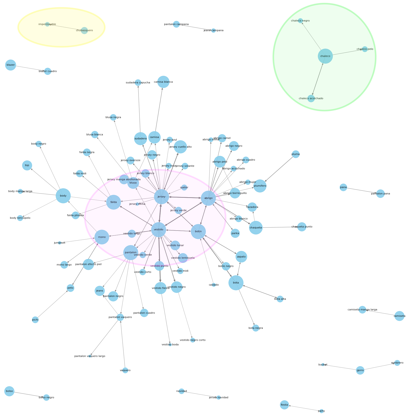
In an online fashion store, fewer products are purchased in one session and the user spends more time finding the appropriate pieces of clothing. The journeys are composed of refining queries from the initial search, with different styles, materials, colour and price (jeans -> jeans low waist -> jeans low waist black)
The high-level overview graph for the fashion shop data below shows a main, strongly connected cluster, with some outliers. It provides a quick overview of the most popular search terms (in the centre of the cluster) that may be used for an initial display of products or shown as first categories while browsing. The tiny groups disconnected from the original cluster usually represent specific term refinements or synonyms that may be used to enhance our user’s search strategies (ex. sweater -> hoodie).
Alternatively, a different analysis may be performed, focused on each of the most popular terms: by definition, any improvement in their search performance will have a high impact.
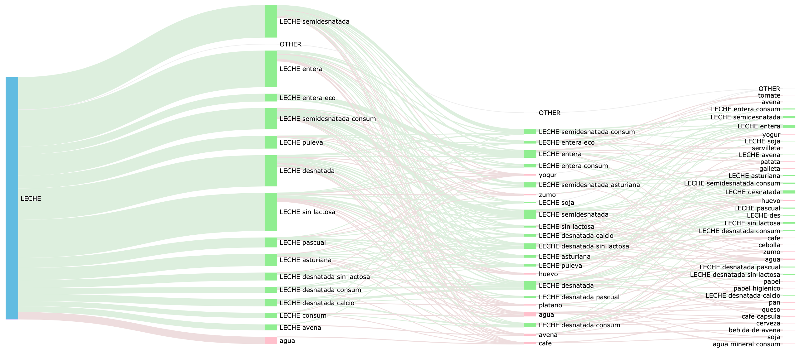
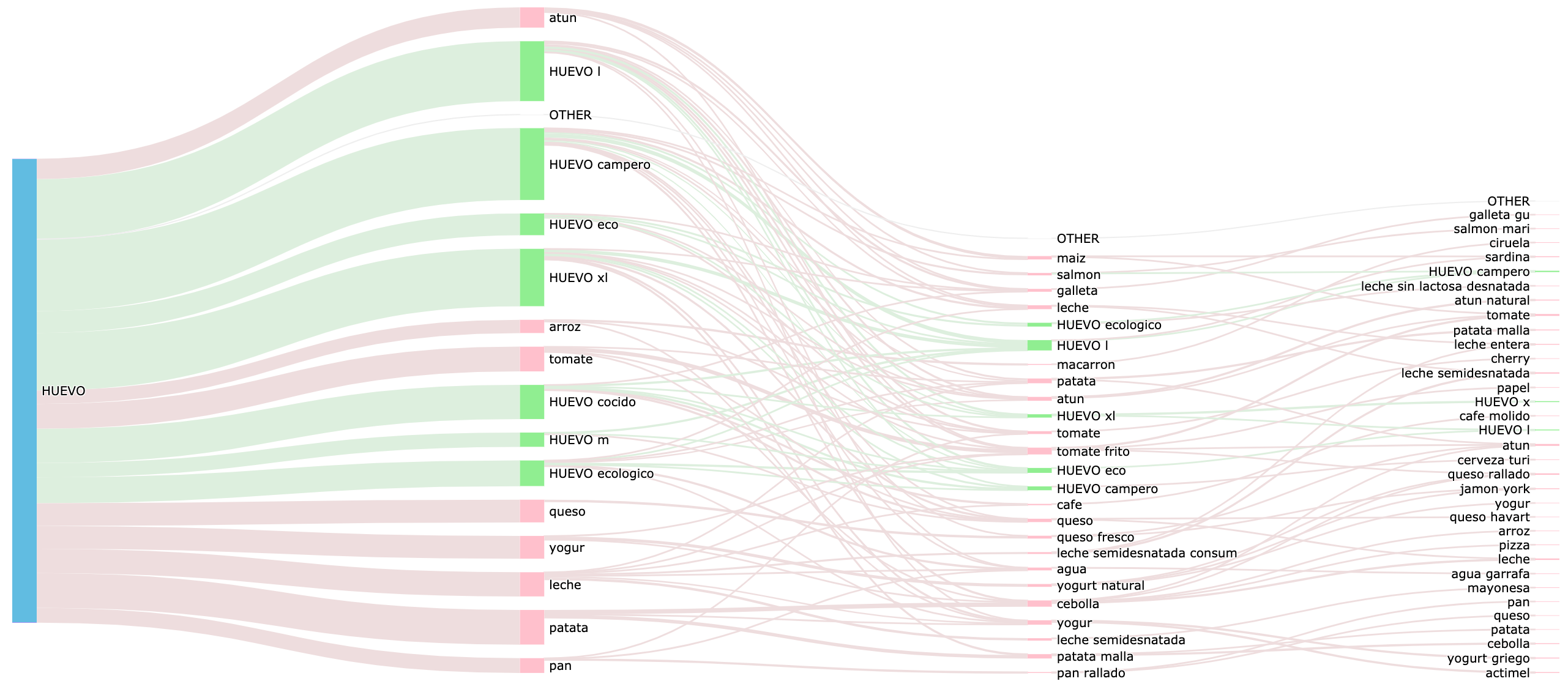
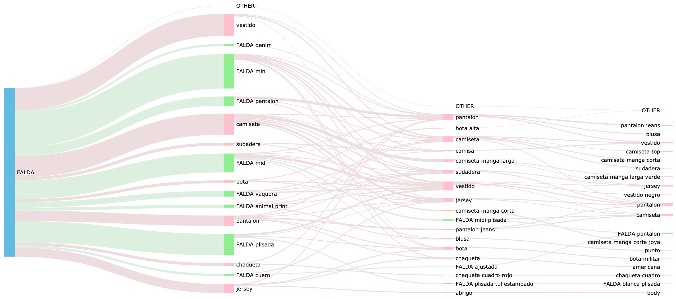
One compact and yet powerful term-centered visualisation may be achieved with a Sankey diagram. The Sankey diagrams can be used to depict the evolution of the user search flow, starting from the root term.
On our Sankey diagrams, the line widths among terms represent the frequency of the sequence, and the node heights reflect the occurrences of each term at that position inside the journey. The refinement queries (containing the main term plus some additional terms, such as trousers -> black trousers) are depicted in green and the queries for a new product (for example, trousers -> pullover) are coloured pink. The higher presence of green colour along the multiple journey steps on the left figure (term ‘milk’) compared to the right one (for ‘egg’) suggests that in the milk case the user needs to refine the query multiple times to get to the desired product while egg queries result in a more straight-forward experience. This analysis helps to identify terms where improvements could be made to the search suggestions, the product categorizations or the search filters.
The Sankey diagrams are also adequate for the fashion data (figure 3, term skirt). At just one glance one can select appropriate autocomplete terms (ex. ‘skirt mini’), related products (ex. ‘dress’, ‘t-shirt’) and get a targeted overview of the user search experience regarding a particular term.
Deepening further the detail level, an alternative term-centered analysis could be done by evaluating the overlap of the journeys containing that particular term. Such a strictly real journey visualisation as the one depicted below, could be quite lengthy due to the lack of aggregation – but more proximate to the user reality. The journeys with higher overlap are shown first.
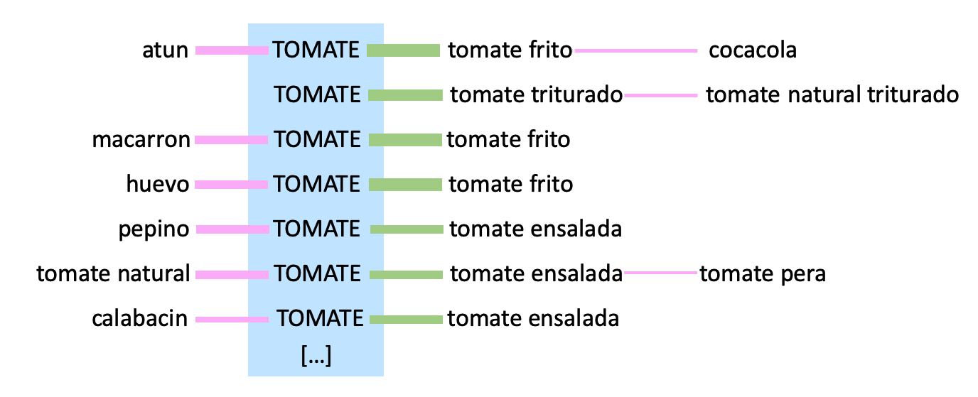
This a detailed insight on the search journey could help us to tackle specific search performance issues.
In the figure, users searching for the term ‘tomato’ go on to refine the initial query as ‘tomato sauce’ or ‘salad tomato’. To avoid this extra step, the search results sorting could be improved by considering the previously searched terms. This way, ‘tomato salad’ products could be listed first as search results for ‘tomato’ when the user looked for fresh vegetables right before. Similarly, ‘tomato sauce’ products would acquire a higher rank when ‘pasta’ or ‘egg’ appear previously during the journey, avoiding unnecessary refining searches.
While we have explored the difference in user journey behaviour in two different market verticals, there are other characteristics of the way searches are implemented in a website, such as autocomplete, suggestions, filters, partial matches (query is sent before the user finishes writing the word), back arrow behaviour and so on, that will affect the observed behaviour. These technical factors should be studied in addition to the business-related ones (product diversity, catalogue size, customer distribution) by performing adequate analysis. Generating relevant results in an automated and efficient manner, from different data sources, is one of the challenges we are facing when taking the user journey analysis to production.
Describing the full potential of analysing such complex data goes beyond the scope of this post. We presented this selection of figures generated from real searches as a source of inspiration for the multiple possibilities that the exploration of the user journey opens up.
These new shopper possibilities and fresh buyer inspiration deeply inform the user journey’s through Empathy.co search and discovery interfaces. And Empathy.co insight reporting reflects these remarkable advances. We will keep you posted on progress about these analytics that offer an amazing world of possibilities for search queries. Our challenge now is to offer the best way to represent this information in the most insightful, user-related and value-producing way.


